It's been a very long time since I did a UI oddity post. I actually do spot them fairly regularly, but I'm usually pressed for time and never get around to it. Fortunately, right now I have an annoying UI feature in front of me and I have time to post about it. Observe the screenshot below (and ignore the fact my Google+ life appears fairly well dead).

I don't want to give Google a hard time as they have highly skilled developers and designers, and with the volume of data they get this is probably on purpose. However, try answering the following questions:
- Which button do you click if you want to print the page?
- Which button do you click if you want to go to the calendar settings dialog?
- Which button do you click if you want to change the display density of the calendar?
- Which button do you click if you want help with using the calendar?
- Which button do you click to refresh the calendar?
Here's the answers:
- Print and Refresh are both in the More menu.
- The display density setting is in the bottom cog menu.
- The calendar settings dialog and calendar help system can be found in the top cog menu.
Maybe it is just me, but because I don't use the Google Calendar app overly frequently, I always find myself going between all three buttons until I eventually find the one I want. Intuitively, for me anyway, I would prefer a different layout that would make much more sense to me. I would offer the user the ability to learn that the top cog is only ever related to 'me as a cross-property Google user', and is never related to a specific Google application. I would then have a separate, 'in-app' cog that the user can learn only ever relates to the application they are currently in. The cog as a symbol for configuration works very well, and should be used in all applications consistently.
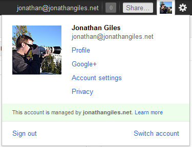
More concretely, I would put the calendar settings in the bottom cog, and possibly even the calendar help, although I'm not convinced help is in the right place in either cog (and should probably be in its own button to help total newbies to get started). I would then consider the most important links that should be consistently displayed to the user regardless of their domain, and put it in the top cog. However, given a little bit of mouse clicking, you can actually already find a perfect rendition of this menu by clicking on either the email address or the small user image. This suggests that there may actually be no use case for the top cog at all, and perhaps a tiny amount of screen real estate can be freed up. You can see this menu in the screenshot below (and behold the wonder that is me pretending to be a photographer).

The only question is if the links in the popup menu are the most important ones, and to me it would seem that they are. So, perhaps there is no need for the top cog at all.
With respect to the 'More' button in the first image, I find it confusing, and would rename it to 'Actions'. This is because it isn't clear to me at all what 'more' is in the button. Based on its placement, I could very easily conclude that it is more calendar layouts (following on from day, week, month, and '4 Days'), despite the small space between the two buttons. To me, 'Actions' makes far more sense - this is the place to go for various actions I can perform upon the calendar, such as printing and refreshing.
Anyway, these are all just my thoughts based on the frustration of the top image button layout. The suggested changes are the result of no real consideration, and I will wait patiently as Google ignore me (due to their massive volumes of design and data arguing against my point). But who knows, maybe one day I'll visit my barely used calendar to find everything I want on the first click. That would make me happy :-)
Thoughts on “UI Oddities #3 – Google Calendar”