Another quick post at a UI that annoyed me today, and today it is beta 2 of the Skype 5 client. Obviously, this is pre-release software, so perhaps it'll be fixed by the final release. Anyway, the message I want to get across in this UI Oddities post is don't make me scroll unnecessarily.
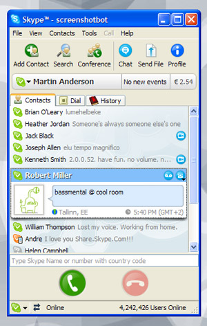
Refer to the image below. This is admittedly an image I found online of a slightly out-of-date client, but the point remains the same: the number of contacts on screen is considerable, given the size of the actual viewport. You can lessen the amount of scrolling even further by setting options inside Skype to hide contacts who are offline (which is my preference). Notice that, in this case, 'Robert Miller' is expanded as this contact has focus. That lets me see more details about that person, but in a normal workflow, this isn't necessary and you'd have all contacts collapsed. Finally, note that the status messages that people sometimes use is to the right of the contacts name.

I like this approach. My main requirement with Skype is to see which colleagues and friends are online, so that I can do my job. I have multiple monitors on my desk, and always have my Skype client visible on one of them. This makes it very easy to track who is online, and perform my job. In other words, the Skype 4 (and less) UI was great for me.
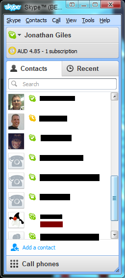
Compare the first screenshot to the second screenshot, which comes from my machine. In this case more emphasis is placed on the persons profile image, and therefore the amount of scrolling required is considerably more. In this case the status messages appear beneath the contacts name, rather than to the right, and space is reserved even if there is no status message. In the screenshot, there is only one status message (which is the dark red box). I'm sure this design is justified internally because the image is now bigger (even when the user doesn't have an image defined), but in general I don't like it because, as I said at the beginning, it requires me to scroll considerably more, and I can't have my Skype window tall enough to see all online contacts at any one time.

As soon as I started up the new beta Skype client, I tried to dig through the options to try to change this. In my ideal situation, the image would be removed and the status message would return to it's more logical location at the right of the contacts name. Alas, I failed to find anything in the options area, but I'm secretly hopeful that I just missed it, or that it'll turn up in a future beta release.
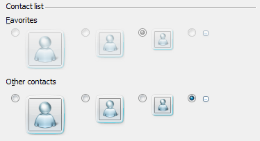
For what it's worth, my wish for an option to configure how the contacts looks isn't without precedent. Windows Live Messenger has an options window, and one section of it contains the options shown in the screenshot below. In this case Windows Live Messenger lets me specify what both my favorites and my other contacts look like. Elsewhere in the options window I've set it that I don't want to have favourite contacts. As shown in the screenshot below, all other contacts take the appearance of a small rectangle only (with the colour of the rectangle signifying the users status). This maximises the number of contacts I see onscreen, which is exactly what I need.

I really hope to see a similar option in a future release of Skype 5, as the current approach is a huge nuisance for me. In general though, the message of this post is to other UI designers to consider your user, especially in cases where there is a potential for them to have a lot of data being presented, and where there may be some form of passive updating going on within the view. In these cases, there is considerably more value in presenting more data to the user at any one time over whitespace, which is unfortunately the direction Skype is currently going.
Thoughts on “UI Oddities #3 - Skype”