Every so often I use some software in my day-to-day life that, whilst useful, slightly perturbs me. I thought I'd catalogue these, and perhaps keep an eye out to see if in future releases of the software it is improved. These posts won't be based on any one software family or language, and will be infrequent in nature - just whenever I stumble across UI that bothers me. I encourage readers to disagree with me or provide their own thoughts. These posts, as with all my posts, are off-the-cuff remarks that aren't hugely considered and are likely to be flawed - help keep me honest :-)
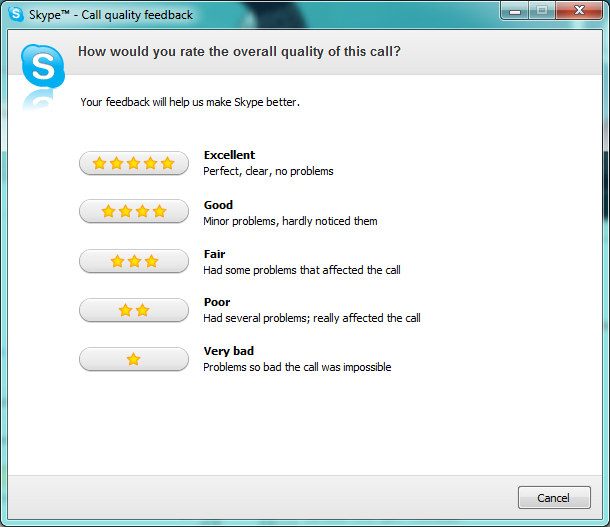
First up is Skype. I'm running Skype 4.2.0.0169 on Windows 7. I use Skype very often as I work from home and pay them a small amount each month to get 'unlimited' calls to the US. Often times at the end of the call I'm asked if I want to give feedback as to the call quality of the previous call. Almost always the quality is excellent, and I'm always happy to tell them that. So, up pops the dialog, which looks like the following (click for full size):

So, in many regards the dialog is tidy. I like the use of stars to indicate the quality, making them the actual button to click is very nice. I like the summaries given for each of the five options - it seems clear when to select which option. Finally, I like the general design of the dialog. It's professional and clean.
The problems I have with this dialog are small and finicky. Firstly, where did one-third of the dropshadow on the Skype image disappear to in the top-left corner? Secondly, why put the 'Cancel' button down the bottom-right corner? Thirdly, why is the dialog the height it is? There is about 90 pixels of wasted whitespace at the bottom of it, and the window isn't resizable.
Fair enough though - this dialog is not intended to stick around - you give the feedback and that's it, right?
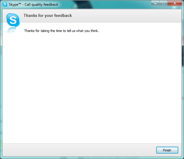
Well, that's where the real oddity begins. That isn't the end of the interaction. Once I give my feedback I'm subjected to a second page of the dialog:

So, after being helpful, I now get the privilege of being thanked and then having to close the dialog myself. This is when the height of the window becomes frustrating - I clicked in the middle of the dialog on the previous page, and now I need to move my mouse a considerable distance to get to either of the close/finish buttons.
My suggestions are simple and require only minor changes:
- Thank the user for their consideration towards giving feedback on the first page. Even if they don't want to help it never hurts to be thankful. Especially considering you did just pop up a dialog and steal their attention.
- Consider moving the cancel button on the first page to instead be a sixth option in the central pane of the first page. Call it something like 'I prefer not to say' and choose an appropriate icon to easily indicate visually that a user uninterested in helping would click it instinctively.
- Get rid of the thank you page entirely. Regardless of the feedback given on the first page, simply dismiss the dialog. Don't make me click again.
That's it. Given this small change I think the Skype 'call quality' dialog would be improved and certainly a little less annoying (given it's a frequently recurring dialog). Admittedly, it's not a light-and-day improvement, but then often-times UI improvement are just a collection of small tweaks, and this is just another one that should be considered in light of any future UI improvements that they may plan.
Thoughts on “UI Oddities #1 - Skype”